Datamap Flows
Datamap Flow
OverviewData Map flows display how different Data Map systems interact with each other. It provides details such as the Data Type shared between systems, its frequency with which data is shared, the existence of Sensitive Data, etc.
DataMap flows can be created in three ways. They can be created on the DataMap flow page. They can be created from survey answers on the Survey to DataMap config page and then finalized on the Save to DataMap Preview page before creation. They can also be uploaded via the Uploads Module.
Viewing a DataMap FlowTo view DataMap Flows, follow these steps:
From the hamburger menu, select DataMaps

From the DataMaps page, click on Data Flows
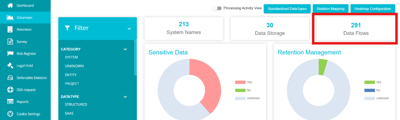
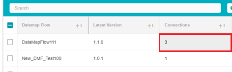
Note: The number on the DataMap Flows box shows the number of connections on all existing flows, not the number of flows.
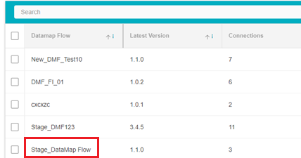
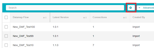
Here, the list of existing DataMap flows will be displayed.
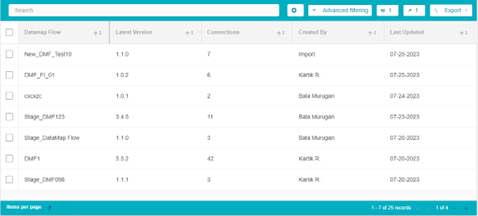
The different fields on the table are:
DataMap Flow: The title of that DataMap Flow
Latest Version: The version of the DataMap Flow created most recently. Information on creating different Flow versions is available below.
Connections: The number of unique interactions/connections between two different systems on the flow. Each flow can have any number of systems interacting with each other. For example, there are 4 systems on the flow, named Apple, Pear, Mango, and Orange. Apple and Orange have 1 connection, Apple and Pear have 1 connection and Orange and Mango have 1 connection. The total number of connections here will be 3.
Created By: The name of the user who created the flow. If the flow was uploaded via the Uploads module, this field will display Import.
Last Updated: When the flow was last worked on.
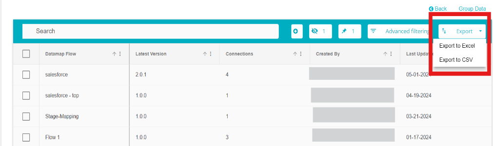
The DataMap Flow table can be exported in an excel or CSV format by clicking on the export button and selecting the required format.
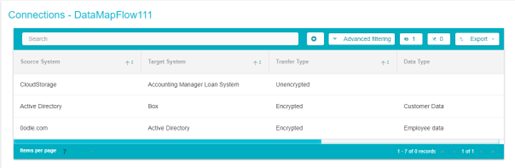
Click on the title of any flow to view it in a graph format
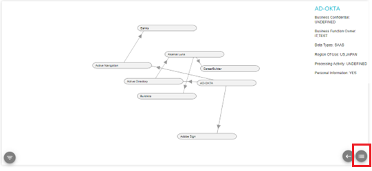
The graph view of the flow is displayed here
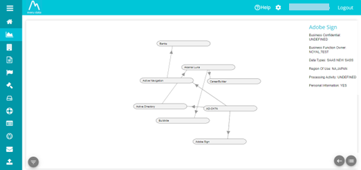
The graph displays the different systems connecting with each other
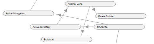
In this case, the System Akamai Luna shares data with the Systems Career Builder and Buildkite. Here, Akamai Luna is the source system and CareerBuilder and Buildkite and are the target systems. Active Directory shares data with the Akamai Luna and receives data from AD-OKTA who shares data with Active Navigation.
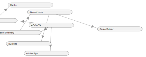
Newly added target systems will appear in front of existing target systems. As shown in the example below

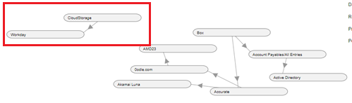
Newly created, independent source and target systems appear separately on the graph as shown below
To view how any system interacts with another, hover over the arrow between the two systems
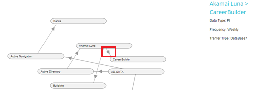
In the above example, on hovering over the arrow between Akamai Luna and CareerBuilder, we can see the transfer details. The source system is Akamai Luna and the target system is CareerBuilder. We also see that the type of data that Akamai Luna shares with CareerBuilder is PI or personal information. Transfer Type shows how the source system shares information with the target system, it could encrypted data, via API's and so forth. We can also see the frequency with which the data is shared.
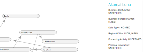
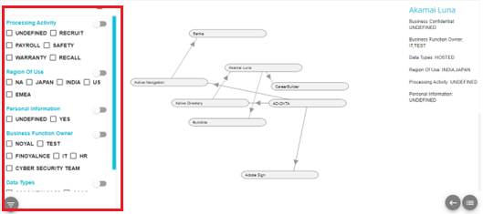
Hover over the system node to view the details of that system. In the example below, on hovering over Akamai Luna, we can see the details for that system.
If any System details have not been defined yet, then that field will show UNDEFINED, as seen below
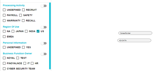
To filter the data on the flow, click on the filter button on the bottom left corner of the screen
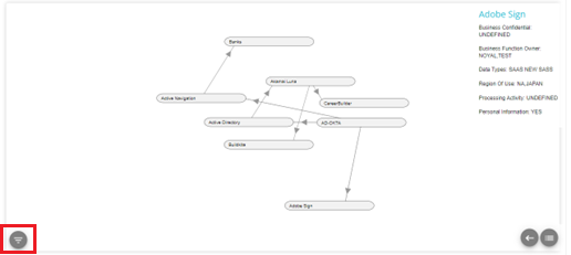
The filter pop-up will appear
Click on any option under any category (Processing activity, Region of Use, etc) to filter the graph to display the systems containing the selected option. For example, if the option U.S is selected under Region of Use, then the flow will show all the system's having U.S as their region of use. This is demonstrated in the image below:
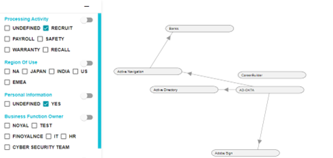
Note: Some System's have details that are undefined. The flow can be filtered on this UNDEFINED category as well.
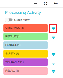
In the example below, the flow has been filtered to show the systems with Recruit as their processing activity as well as systems having PI.
The graph can also be organized by color. Switch the colour toggle to on against any required category to organize the graph by color
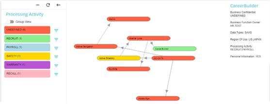
On doing so, each system on the graph will be highlighted based on the option that applies to them.
In the example below, all the System's with Undefined Processing Activities are coloured red, the system with Recruit as it's Processing Activity has been coloured green and so forth. In this way, the graph can be organized to show the systems falling under different categories in different colours.
The colours are assigned in a random order.
Some systems can fall under more than one category. For example, the system Akamai Luna has 2 countries under Region of Use: India and Japan. In this case, the colour assigned to Akamai Luna can be either that applicable to India or Japan.
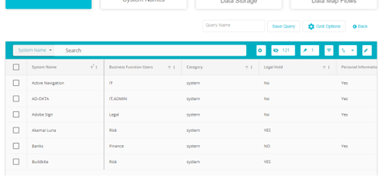
Click on the filter button against any option to be taken to the DataMap grid page for those systems. On this page you will be shown all the systems from this flow containing that option. For example, on clicking on the filter button beside Undefined, you will be redirected to the Datamap page showing all the systems from this flow with undefined processing activities.
From here, you can go to the system details page of any of the systems from the flow having undefined processing activities
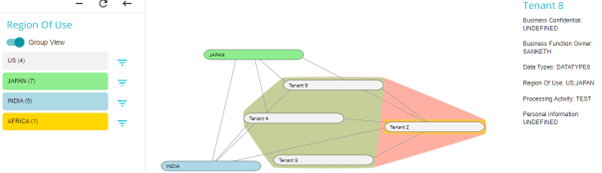
On enabling the Group View, the different systems falling under the selected category options are highlighted in that color and grouped together. In other words, each option under the selected category is grouped together. On clicking any option on the Filter tab, the systems falling under that option are highlighted and displayed together.
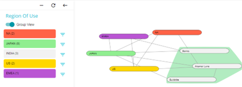
In this example, the systems with India as their Region of Use have been highlighted and grouped with the blue color.
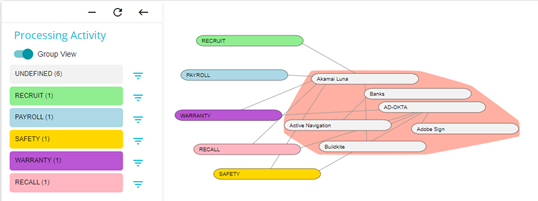
In the example below, all the groups with Undefined Processing Activities have been highlighted and grouped with the red colour.
If more than one option is applicable to any system, then that system will be highlighted with a combination of colours of both/all the applicable options.
In the example below, Tenant 6, Tenant 4, and Tenant 8, have US and Japan as their region of use which is why they are highlighted in a mix of green (Japan) and red (US). Tenant 2 has US and Africa as a its region of use which is why it is highlighted in a mix of yellow (Africa) and red (Japan).
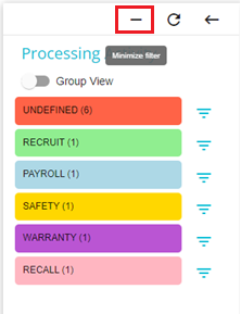
Click on the below button to minimize the filter tab
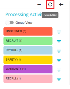
Click on the below button to refresh the filters applied
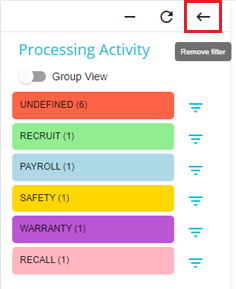
Click the below button to remove the applied filters
The different versions of the flow can also be viewed by clicking the hamburger menu on the bottom right of the screen
Here the different versions of the flow will be available, pick any version to view it

Click and drag any system on the flow to move its position. In the example below, System CareerBuilder has been moved farther right. Changes made to the position of the system nodes are saved.
In this example, whenever this flow is opened in the future, the position of CareerBuilder will be as it is shown below until it's position is changed again.
Double-click on any system to be directed to the System Details page for that system.
Multiple flows can be grouped together to display a comprehensive flow.
To group multiple flows:
Tick the flows you want grouped
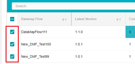
Once the flows have been selected, click on the Group Data button
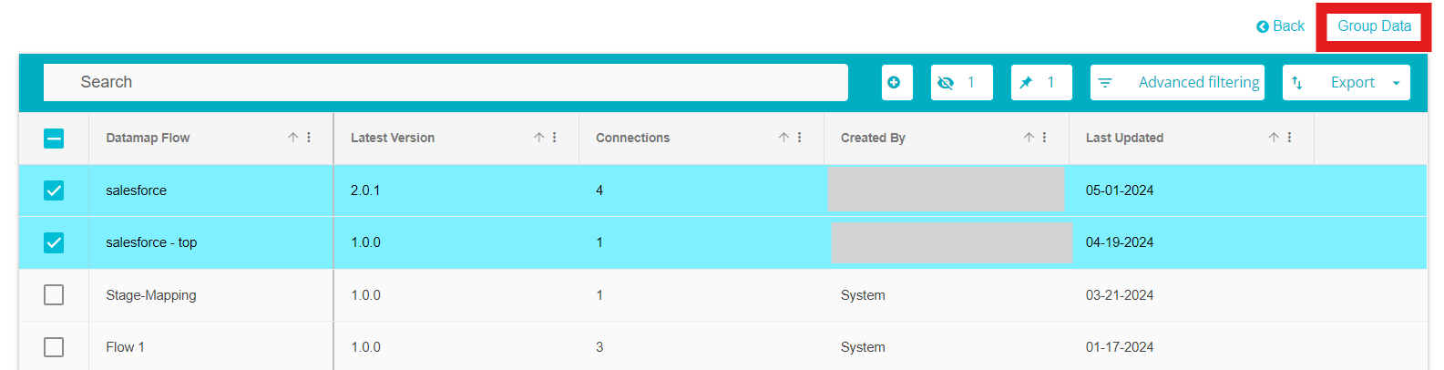
The selected flows will now be displayed as one flow Note: This is not a permeant change. The grouped flow cannot be saved.
DataMap Flows can be created in three ways. They can be uploaded through surveys; the configuration can be made on the Survey to DataMap config screen and finalized on the Save to DataMap preview screen. They can be uploaded via the file imports module. The guide can be found here - Upload guide - citations, DataMap, subsystems, DMF .docx
Flows can also be created from the DataMap Flow page itself.
To create a flow from the DataMap Flow page, follow these steps:
From the DataMap Flow page, click on the Add button
On doing so, a new flow row will appear
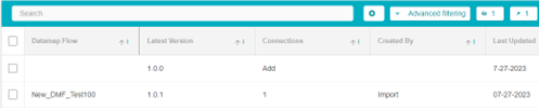
Type in the name of the new flow under the DataMap Flow Field
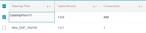
Next, click on Add under the Connections field
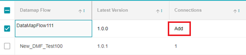
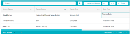
You will be directed to a new page, here you can enter the details of the flow
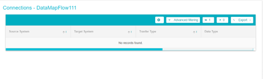
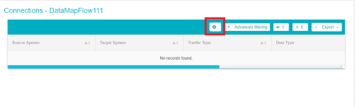
Click on the Add button to add the details of one connection
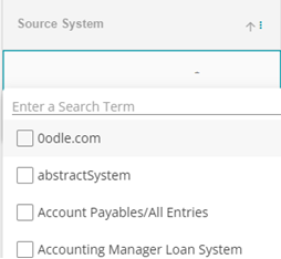
Next, you can double click on any field to add details to that field. From the drop-down menu, select the Source System
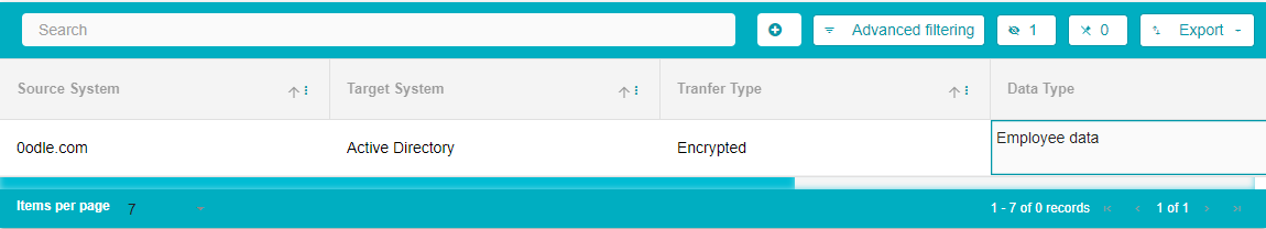
Next from the drop-down menu, select the Target System Note: Two of the same connections cannot be made. For example, if one connection has been made with Accurate as the source system and Box as the target system, then another system cannot be made with Accurate as the source system and Box as the target system again.
Further, the Source and Target system fields cannot be left empty
Type in the other details like the Transfer Type, Data Type and Frequency
Note: When creating flows via the Uploads module, the option to enter additional details is available. The additional fields can be Sensitive Data, Region of use etc.
Multiple connections with their details can be added in the same way by clicking the Add button to create a new connection.
Once all the details have been added, click on the Save or Save as buttons available at the bottom right of the screen.
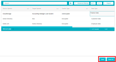
Save As: Click Save as to save the flow as a Minor version. Save as a minor version for smaller updates.
Save: Click Save to save the flow as a Major version. Save as a major version for larger updates.
Examples of Major Versions - 1.0.0 > 2.0.0 > 3.0.0
Examples of Minor Versions - 1.0.0 > 1.0.1 > 1.0.2
Once the flow has been saved successfully, the following message will appear on the screen

To edit a flow, click on the Connections field of the flow you want to edit
The flow details page will open where you can make the required edits
Once the changes have been made, click on Save or Save As as required.
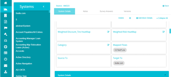
The flow details are also added to the System Details page of those systems. For example, System AMD23 is a part of the DataMap Flow - CCTestFlow. This can be seen in the mapped flows field. This field shows all the flows that this system is a part of.
Next, the Source to field shows all the systems that this system is a source system to.
The Target to field shows all the systems that this system is a target system to. In this example, in the flow CCTestFlow, one connection has 0odle as the source system and AMD23 as the target system.